Gutenberg Times: 14 ways to add Custom CSS in WordPress Block Editor
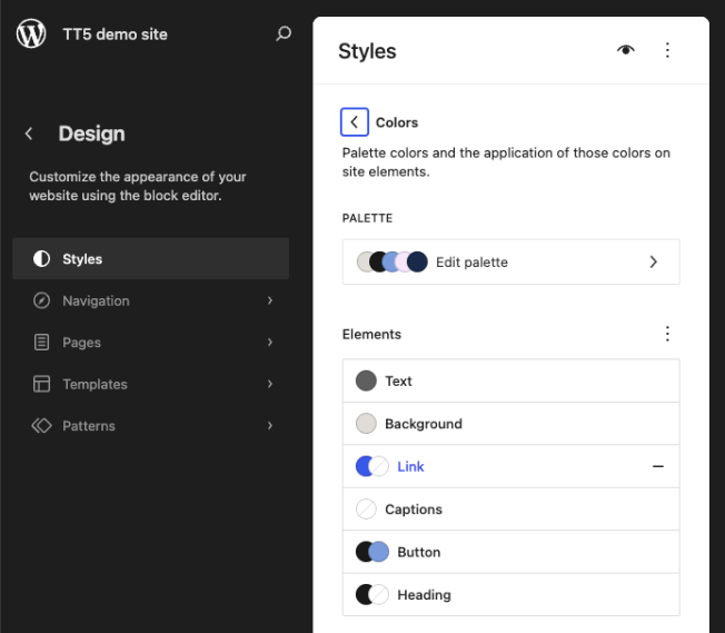
With the new Custom CSS on a block and post/page level, I was wondering if I would know where to look if something needs to be changed that was modified by a Custom CSS setting. Turns out there are 14 different ways to skin WordPress. I am a fan of keeping one source of truth, but it might not always be possible to keep it in theme.json. So I also wanted to figure out what decisions making process goes into selecting a method in the first place. Below is a comprehensive reference for users, site builders, designers and developers covering all methods from no-code to full theme development. These methods only apply to Block themes, though. Classic theme methods (like the Customizer’s Additional CSS panel etc.) are excluded. Table of contents The specificity cascade 1. theme.json — structured style properties 2. theme.json — The css Property 3. Custom CSS Properties (Variables) via theme.json Settings 4. Child Theme’s theme.json 5. Global Styles UI 6. Additional CSS 7. Per-Block Additional CSS 8. Additional CSS Class(es) on individual block instances 9. Global Style Variations (Theme-Level Style Presets) 10. Block Style Variations (JSON, PHP, and JavaScript) 11. Section Styles 12. Block Stylesheets via wp_enqueue_block_style() 13. Enqueuing Stylesheets via wp_enqueue_style() in PHP 14. The Theme’s style.css Summary Table Decision Guide The specificity cascade Before diving in, it helps to understand WordPress’s style hierarchy for block themes. Styles resolve in this order, with later layers overriding earlier ones on four levels. Default mostly the styling and layouts of WordPress Core. Block-level styling can be altered with plugins and overwrites the Default styling. Theme-level styling is the whole suite of design tools controlled by the active Theme. It overwrites Default and block-level styles and layouts for instance (e.g. template and template parts). User-level styling uses the Design tools within the Site Editor to modify styles and layouts. These changes are stored in the database and overwrite the theme-level styling. Within each layer, more specific targets (per block, per element) override more general ones. This cascade is central to how all the methods below interact. 1. theme.json — structured style properties Who: Theme developers, child theme authorsWhere: theme.json (root of your theme) → styles section This is the recommended first choice for styling in block themes. Rather than writing raw CSS, you define styles as structured JSON properties — colors, typography, spacing, borders, shadows, and more — at the global, element, or per-block level. You can use hardcoded values directly in styles, and they work just fine: JSON { « version »: 3, « styles »: { « color »: { « background »: « #ffffff », « text »: « #333333 » }, « elements »: { « link »: { « color »: { « text »: « #0073aa » } } }, « blocks »: { « core/button »: { « color »: { « background »: « #0073aa » } } } } } { « version »: 3, « styles »: { « color »: { « background »: « #ffffff », « text »: « #333333 » }, « elements »: { « link »: { « color »: { « text »: « #0073aa » } } }, « blocks »: { « core/button »: { « color »: { « background »: « #0073aa » } } } } } As your theme grows, hardcoded values become harder to manage. If you decide to change your primary color, you’d need to find and update every instance of #0073aa across styles. A more maintainable approach is to define your values as presets in the settings part of theme.json and then reference them in styles using the var:preset|| syntax. WordPress converts these presets into CSS custom properties (e.g., –wp–preset–color–primary), keeping everything connected: JSON { « version »: 3, « settings »: { « color »: { « palette »: [ { « slug »: « primary », « color »: « #0073aa », « name »: « Primary » }, { « slug »: « base », « color »: « #ffffff », « name »: « Base » }, { « slug »: « contrast », « color »: « #333333 », « name »: « Contrast » } ] }, « typography »: { « fontSizes »: [ { « slug »: « medium », « size »: « 18px », « name »: « Medium » } ] } }, « styles »: { « color »: { « background »: « var:preset|color|base », « text »: « var:preset|color|contrast » }, « typography »: { « fontSize »: « var:preset|font-size|medium », « lineHeight »: « 1.6 » }, « elements »: { « link »: { « color »: { « text »: « var:preset|color|primary » } }, « heading »: { « typography »: { « fontWeight »: « 700 » } } }, « blocks »: { « core/button »: { « border »: { « radius »: « 4px » }, « color »: { « background »: « var:preset|color|primary » } }, « core/quote »: { « typography »: { « fontStyle »: « italic » } } } } } { « version »: 3, « settings »: { « color »: { « palette »: [ { « slug »: « primary », « color »: « #0073aa », « name »: « Primary » }, { « slug »: « base », « color »: « #ffffff », « name »: « Base » }, { « slug »: « contrast », « color »: « #333333 », « name »: « Contrast » } ] }, « typography »: { « fontSizes »: [ { « slug »: « medium », « size »: « 18px », « name »: « Medium » } ] } }, « styles »: { « color »: { « background »: « var:preset|color|base », « text »: « var:preset|color|contrast » }, « typography »: { « fontSize »: « var:preset|font-size|medium », « lineHeight »: « 1.6 » }, « elements »: { « link »: { « color »: { « text »: « var:preset|color|primary » } }, « heading »: { « typography »: { « fontWeight »: « 700 » } } }, « blocks »: { « core/button »: { « border »: { « radius »: « 4px » }, « color »: { « background »: « var:preset|color|primary » } }, « core/quote »: { « typography »: { « fontStyle »: « italic » } } } } } This token-based approach pays off in a few ways. When a user changes “Primary” in the Global Styles UI, every element referencing that token updates automatically. It keeps your theme internally consistent — no risk of one button being #0073aa while another drifted to #0074ab. And it makes global style variations far simpler to create: a dark mode variation only needs to redefine the palette, not hunt down every color reference in styles. Either approach is valid, but tokens tend to save time as a theme matures. Advantages: Automatic integration with the Global Styles UI: Users can view and override your styles in the Site Editor without writing CSS. WordPress manages specificity for you: the “base → theme → user” cascade works correctly. Generates CSS custom properties automatically (e.g. –wp–preset–color–primary). Visual parity between editor and front end. Machine-readable: other tools and plugins can consume and extend these styles. Reduces the amount of CSS enqueued overall. Limitations: Can only express what theme.json’s schema supports (growing with each release, but not yet comprehensive). Pseudo-classes like :hover, :focus, :active, and :visited are supported for elements such as links and buttons (e.g., « elements »: { « link »: { « :hover »: { « color »: { « text »: « var:preset|color|contrast » } } } }), but pseudo-elements like ::before and ::after, media queries, and more complex selectors
Gutenberg Times: 14 ways to add Custom CSS in WordPress Block Editor Lire la suite »